A church website is not a brochure you set and forget. It is the digital lobby for guests, newcomers, and members checking details on Saturday night. Small mistakes—wrong times, broken links, a donation page that errors—signal something larger: “Nobody is tending this place.”
The church website mistakes people notice instantly
Outdated service times and address tops the list. Next is hiding basic facts behind clicks: visitors should see when you meet, where you park, and what to expect without hunting. Another common issue is no clear next step—only a wall of ministry pages and no invitation to visit, plan a visit, or contact a real person.
The cost is invisible. Guests do not argue with you; they simply do not come. Members give up and text you instead, which trains everyone that pastoral time is the real help desk.
Security warnings and expired SSL certificates are trust killers too. If someone’s browser flags your site, they may never tell you—they will just close the tab.
Fix trust with a simple “first visit” path
Put service times, location, and a plain-language welcome on the homepage. Add one photo of real people from your church—not stock smiles that feel like a bank. Test your site on a phone; most of your traffic will. Schedule a monthly 15-minute review on your calendar—same day as another recurring task so you actually do it.
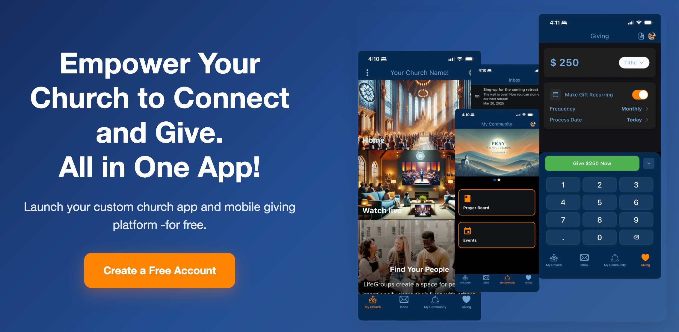
If you use online giving, test a gift the way a newcomer would. Broken giving is not a small bug.
Accessibility matters more than polish. High contrast text, readable fonts, and captions on video sermons help guests and members alike. You do not need a redesign budget—you need compassion in the details.
Assign a named owner for the website, even if they only touch it monthly. “The church” does not update pages; a person does. If nobody owns it, entropy wins and your Easter page still says “coming soon” in July.
How myChelper helps your church website stay connected
myChelper includes a free website builder tied to the same ecosystem as your church’s app, so you are not maintaining two unrelated universes. You can point people to consistent information, link to giving, and align announcements with what members see on their phones.
We will not write your copy or take your photos—that is still yours. We give you a sane foundation. See what is included and pricing for giving fees and plan details.
Consistency between Sunday announcements and the website matters. When those two disagree, people default to confusion—or they message you. A single source of truth saves trust and time, even if the design is simple.
Do this in the next seven days
Open your homepage on your phone. Can a stranger answer three questions in 30 seconds: When? Where? What should I expect? If not, edit until they can. Everything else can wait.
Send the link to one honest friend outside your church and ask them to narrate their first thirty seconds on the site. You will learn more from that exercise than from another internal committee meeting about “branding.”
Helpful tools
Explore the product areas these posts connect to:
Take a simple next step
Curious whether myChelper fits your church? Read what’s included (app, website, giving, and communication in one place), then review pricing so you know what’s free and what has fees. We’re not the right tool for every ministry—and that’s fine.